Context.
Kurt Schwitters was a German painter, sculptor, typographer and writer. Born in Hanover. Studied at the School of Arts and Crafts in Hanover 1908-9 and Dresden Academy 1909-14. Influenced by Expressionism and Cubism 1917-18. In 1918 created his own form Dada in Hanover called 'Merz', using rubbish materials such as lables, bus tickets and bits of broken wood in his collages and constructions. Friendship with Arp, Hausmann and Van Doesburg. Pulished the first edition of Anna Blume ( a collection of poems and prose pieces) in 1919 and the magazine Merz 1923-32. First one-man exhibition at Galerie Der Sturm, Berlin, 1920. Began in 1923 to build fantastic Merz constructions in his house in Hanover (the first'Merzbau'). Spent the summers in Norway from 1931 and emigrated in 1937 to Lysaker near Oslo. Fled to England in 1940, spent seventeen months in internment camps, then lived 1941-5 in London. Moved in 1945 to Ambleside in Lake District. In the last months of his life, he began a further Merz construction in an old barn at Langdale. Died at Kendal.
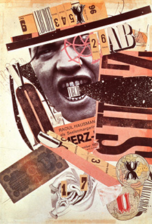
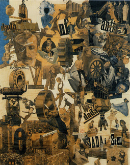
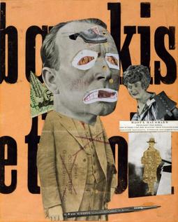
Influences Dada Art
Dada art is an internatioal movement among European artist and writers between 1915 and 1922, charaterised by a spirit of anarchic revolt. Dada revelled in absurdity, and emphasised the role of the unpredictable in artistic creation. It began in Zurich with the French poet Tristan Tzara thrusting a penknife into the pages of a dictionary to randomly find a name for the movement. This act in itself displays the importance of chance in Dada art. Irreverence was another key feature: in one of Dada's most notorious exhibitions, organised by Max Ernst, axes were provided for vistiors to smash the works on show. While perhaps seeming flippant on the surface, Dada artist were actually fulled by disillusionment and moral outrage at the movement was to shock people out of complacency. Among the leading Dadaists were Marcel Duchamp ( whose Mona Lisa adorned with moustache and goatee is a Dada classic), George Grosz, Otto Dix, Hans Richter and Jean Arp. The movement had a strong influence on Pop Art, which was sommetimes called neo-Dada.
|
|
|
Analysis.
What can I see?.
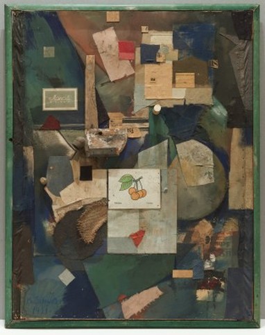
The genre of this image is a portraiture. what I can see is that the artist has used different types of materials and mounted them together to create this collage of different materials, I think why the artist has done this is to make the viewer become confused but inspired to think why would someone create something like this. What else I can see is that the artist has put small little oranges in the centre of the whole portraiture and this makes the viewer wonder why he done this also it stands out from the rest of the image.
Feeling & Mood.
How i feel about the artist work is that i am very amused with it because it gives a feeling of laughter and also it has a piece of fruit in the middle which makes it very bright because the rest of the work is dull and boring. how i think this makes a viewer feel is very confused but also amused because of how the artist constructed the image and then added a piece of fruit in the middle, what makes this image interesting is that the artist put a picture of a piece of fruit in the middle of the image, this is why i picked this image.
Composition.
The focal point of this image is the picture of the piece of fruit in the middle. Why i think this is because the artist has used dull boring colours then he put the picture of the piece of fruit with a bring white background this is where my eyes first look, then i look around the image seeing of the different materials the artist has used.
Colour & Mood.
The main colours that have been used are blue,dark green and cream these colours give a vivid look to the imag, the mood these colours give is a relaxed feeling because colours aren't that bright or very out there. the colour that i think is the dominant colour is the white with the picture of the fruit on it, it give the whole image a bright mood and that it isn't meant to be a very dull image.
Light & Tone.
The direction of the light coming from the image is the center how i can tell this is because the center is very bright and stands out more, the other areas on this image is that the bottom and top half of the image has a dark tone to it this is showing me that the lighting cannot being coming from the top and the bottom. The light adds depth to it because it makes the image itself look deeper when you look at it.
Texture & Pattern
The texture of this image is very jagged because of how the artist has set created the picure and how he layed out the different kind of materials on the image and the pattern of the image is random but complex. Why i say this is because of how the artist has set out his work and has used different materials to make it stand out more.
